Whether you’re pitching to investors, reporting quarterly performance, or aligning your team around growth strategies, your data is only as effective as the way you present it. The key? Choosing the right chart for the right story.
Let’s explore the most powerful chart types and learn exactly when to use each to maximize impact.
1. Line Chart
Use When: Showing trends or performance over time.
Line charts are ideal for visualizing progression, patterns, and long-term changes.
Best for:
- Sales growth over quarters
- Website traffic by month
- Stock price trends
Pro Tip: Use different colors for each line, and avoid adding too many lines at once to prevent visual clutter.

Simple line chart showing sales over 12 months with two product lines.
2. Bar & Column Charts
Use When: Comparing categories or discrete data points.
- Bar Charts: Great for long labels and horizontal comparison.
- Column Charts: Better for short labels and time-based comparisons.
Best for:
- Revenue by product
- Employee count by department
- Customer satisfaction scores
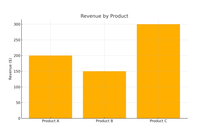
Column chart comparing Q1–Q4 revenue across three product categories.
Try Waterfall Charts for showing progressive gains and losses.
3. Pie Chart
Use When: Showing parts of a whole.
Pie charts are excellent for showcasing proportions, but less is more—keep to six slices or fewer.
Best for:
- Market share by company
- Expense breakdown
- Customer demographics
Avoid: 3D pie charts—they distort perception.
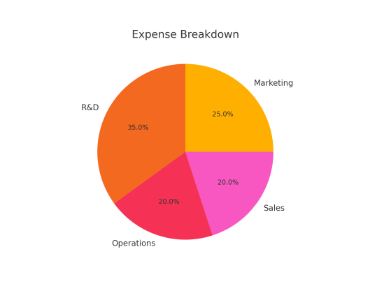
Pie chart showing department-wise budget allocation.
4. Bubble Chart
Use When: Showing relationships and value size.
Think of a bubble chart as a colorful scatter plot with an extra dimension—size.
Best for:
- Ad budget vs. conversion rate vs. revenue
- Risk vs. reward vs. market size
- Financial impact analysis
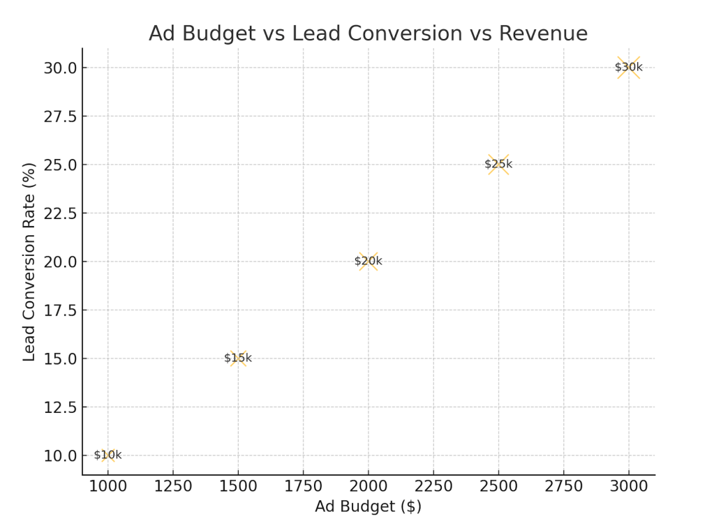
Bubble chart mapping ad budget (X), lead conversion (Y), and revenue (size).
5. Venn Diagram
Use When: Comparing similarities and differences between groups.
Venn diagrams simplify complex logical relationships.
Best for:
- Product feature overlaps
- Customer segments
- Partnership synergies
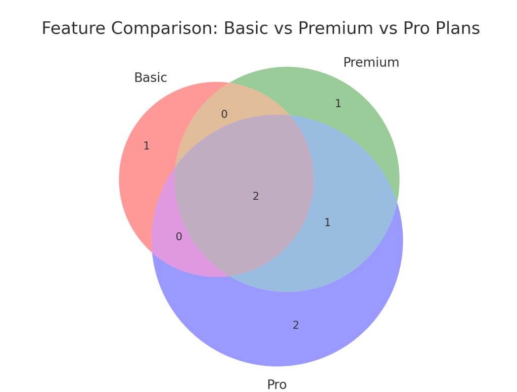
Three-circle Venn diagram comparing features of Basic, Premium, and Pro plans.
6. World Map
Use When: Presenting geographic data.
Maps provide immediate regional context and insight.
Best for:
- Sales by region
- Customer distribution
- Global expansion targets
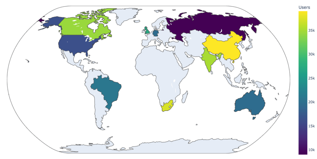
Color-coded world map showing user distribution by country.
7. Timeline
Use When: Showing sequences or historical progression.
Timelines create a natural narrative flow, ideal for showcasing growth stories.
Best for:
- Company milestones
- Product development roadmap
- Campaign schedules
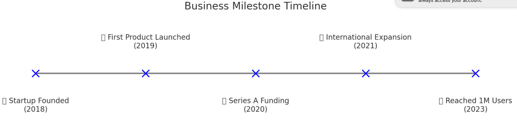
Horizontal timeline with icons showing five major business milestones.
8. Flowchart
Use When: Explaining processes, logic flows, or systems.
Flowcharts break down how tasks flow or decisions are made.
Best for:
- Customer onboarding
- Internal workflow
- Decision-making process
Conclusion: Tell the Right Story with the Right Chart
Data alone doesn’t tell a story—design does. Choosing the right chart isn’t just about visual appeal. It’s about helping your audience see what matters instantly.
✅ Line for trends
✅ Bar for comparisons
✅ Pie for proportions
✅ Bubble for complexity
✅ Venn for overlaps
✅ Maps for geography
✅ Timelines for journeys
✅ Flowcharts for processes
Remember: The best chart is the one that tells your story best.
Disclaimer: All information provided on www.academicbrainsolutions.com is for general educational purposes only. While we strive to provide accurate and up-to-date information, we make no representations or warranties of any kind, express or implied, about the completeness, accuracy, reliability, suitability, or availability of the information contained on the blog/website for any purpose. Any reliance you place on such information is therefore strictly at your own risk. The information provided on www.academicbrainsolutions.com is not intended to be a substitute for professional educational advice, diagnosis, or treatment. Always seek the advice of your qualified educational institution, teacher, or other qualified professional with any questions you may have regarding a particular subject or educational matter. In no event will we be liable for any loss or damage including without limitation, indirect or consequential loss or damage, or any loss or damage whatsoever arising from loss of data or profits arising out of, or in connection with, the use of this blog/website. Our blog/website may contain links to external websites that are not provided or maintained by us. We do not guarantee the accuracy, relevance, timeliness, or completeness of any information on these external websites. Comments are welcome and encouraged on www.academicbrainsolutions.com is but please note that we reserve the right to edit or delete any comments submitted to this blog/website without notice due to: Comments deemed to be spam or questionable spam, Comments including profanity, Comments containing language or concepts that could be deemed offensive, Comments that attack a person individually.By using www.academicbrainsolutions.com you hereby consent to our disclaimer and agree to its terms. This disclaimer is subject to change at any time without prior notice

Leave a comment